Portami Asian Street Food.
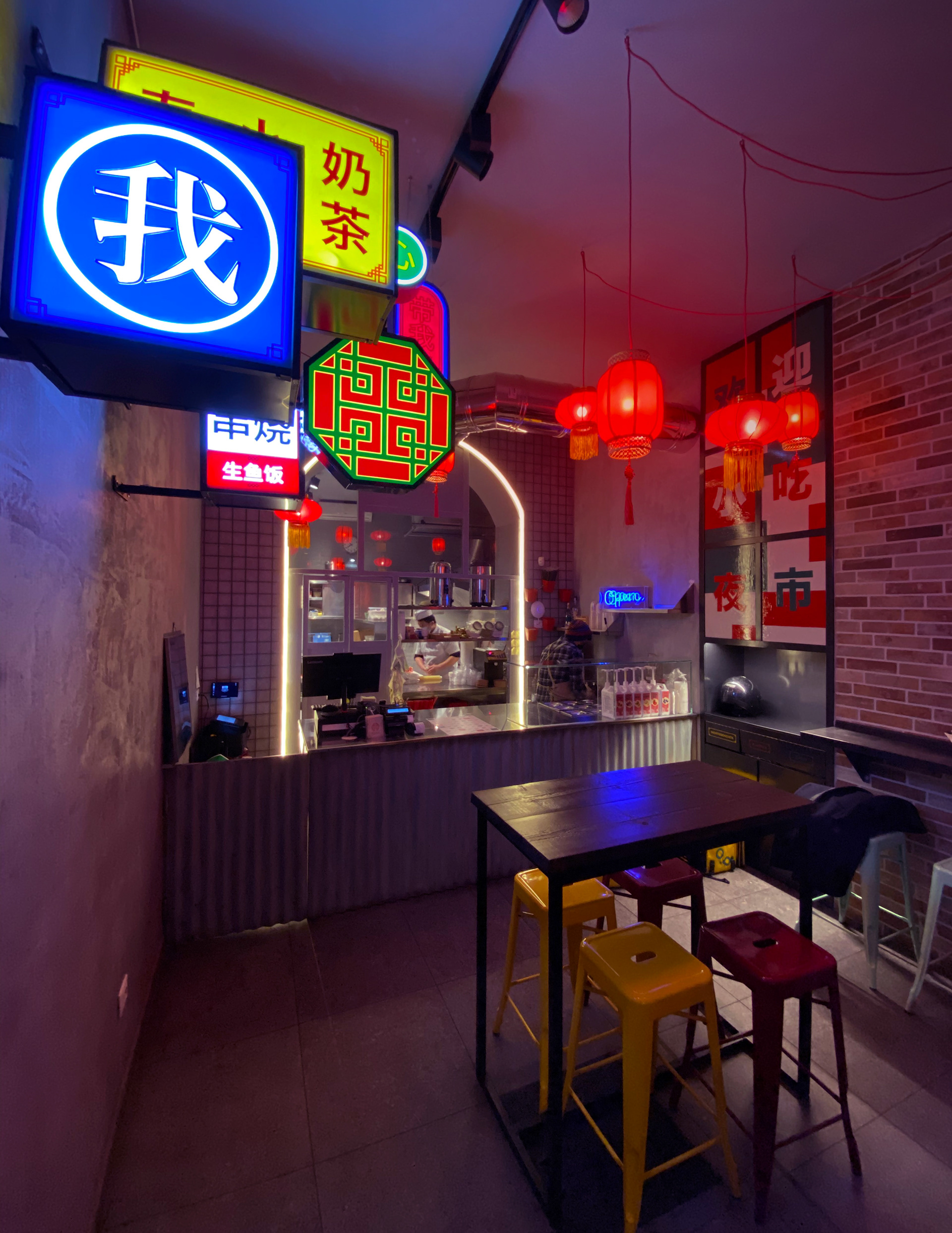
The concept wants to recreate a hypothetical street of Asian street food, in the heart of Milan.
Starting from here, we have developed naming, logo, interior, style of illustrations, packaging line and all the material relating to communication.
The naming is made up of the union of 2 words: PORTA (as if it were a metaphysical door that transports you Asia) and MI (short for Milan). These 2 words, once joined, create PORTAMI: (in Italian means to takeaway).
For the development of the brand we were inspired by the design of ancient doors of Chinese culture while, for the interior, we chose to use materials such as concrete, corrugated metal and raw wood.
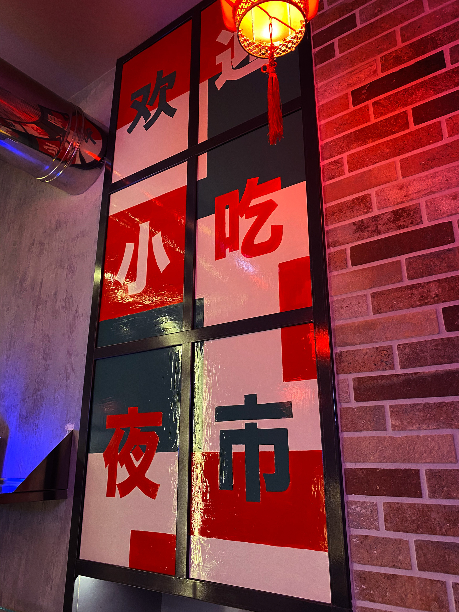
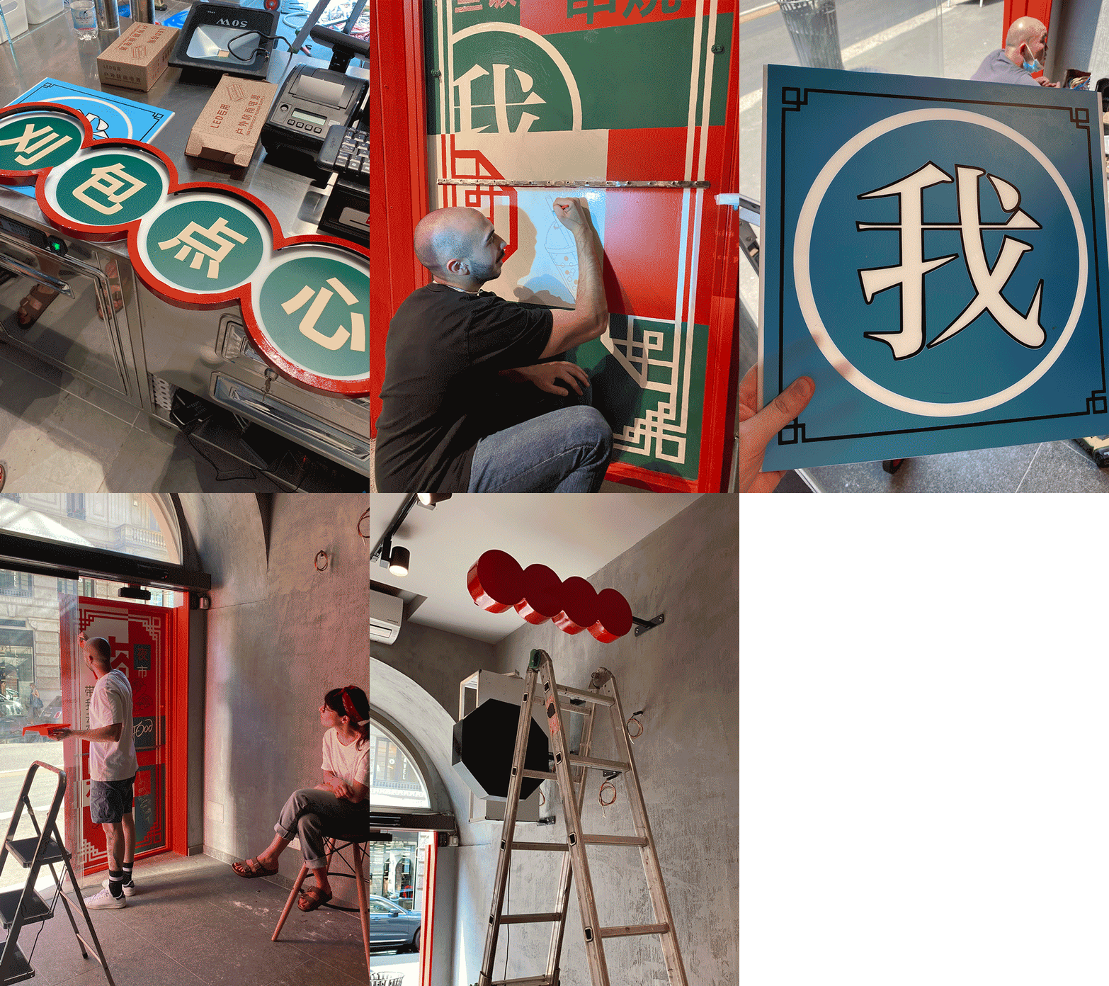
There were also customized graphics for the individual illuminated signs inside the restaurant.
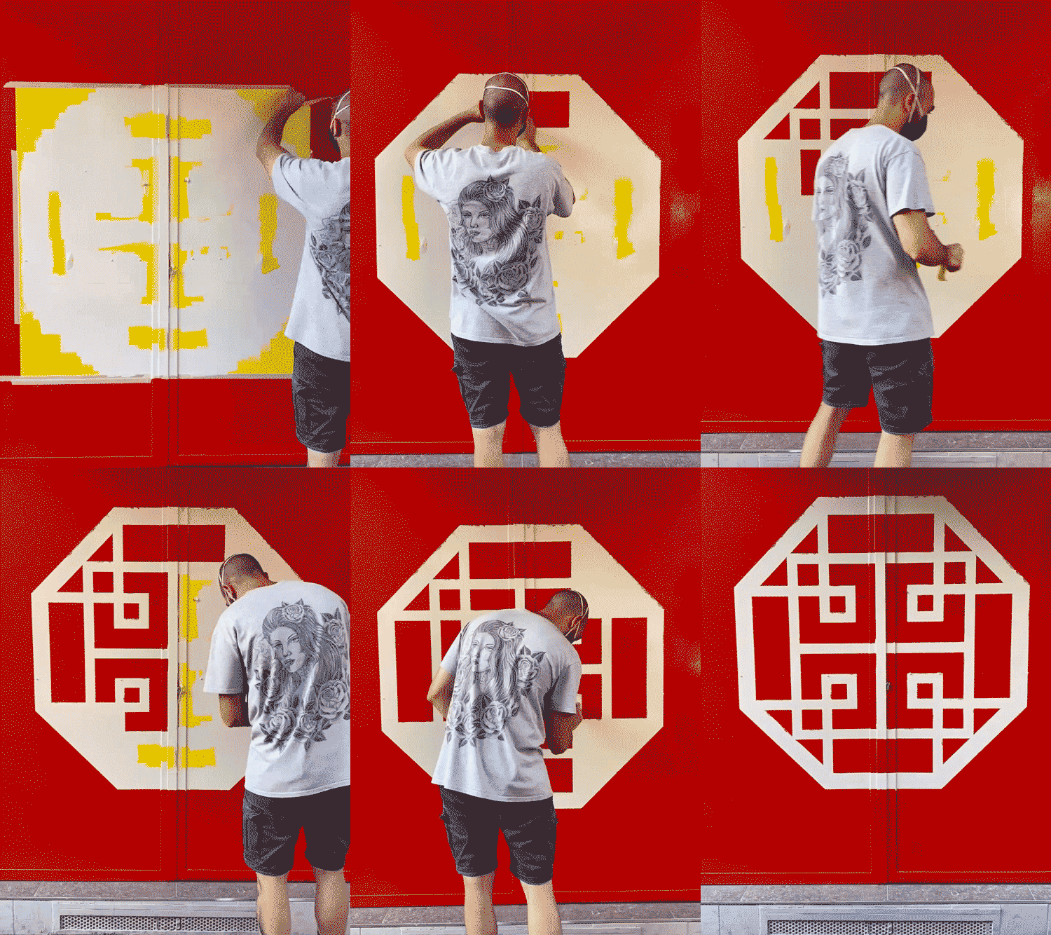
The external doors and some internal panels have been entirely hand decorated with illustrations, colors and graphics of the brand.
Creative Director: Alessandro Aprile
Illustration & Art Director: Laura Cattacin
Painter & Calligrapher: Riccardo Riggio


